Blog
The new Aria Concept Architecture website
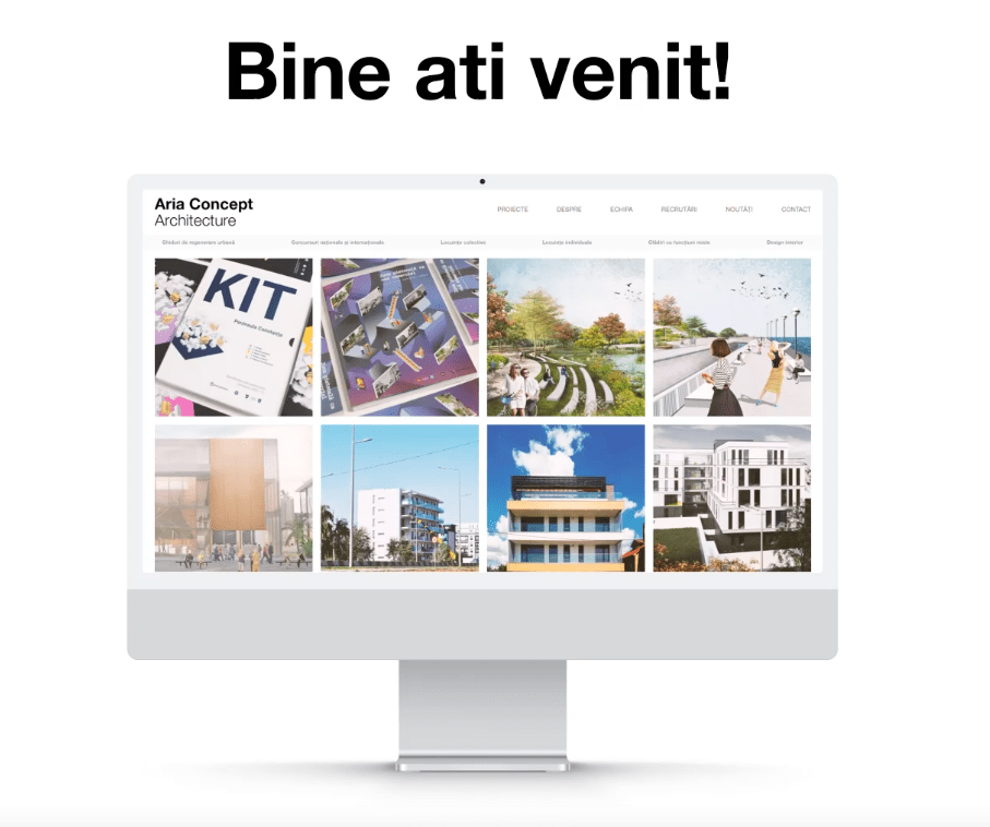
We are pleased to announce the inauguration of our new website.
The main objective was to minimize the user’s distraction from the content by designing a well-structured ecosystem focused on the comparative spatial relationship between the fundamental elements of the page and the user experience. In simpler terms, the design of the new site started from the content, then built an intuitive interface for the user to identify their goal and navigate to it easily.
Aesthetically, negative (white) space directs the user’s eye to important elements on the site, guiding both user experience and actions. Also, simplifying navigation steps reduces user confusion, which in turn improves immersion.
A sober color palette was chosen, consisting mainly of shades of gray. However, the variety comes from the accent colors, which appear in different areas of the site.


